Presto
8/27/2012
photoshop sc5.5
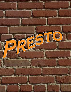
Presto was challenging for me because it
was hard to warp the letters to match the
real presto logo. I used shaddowing at the
top right conrners. I also made sure to add
a black and white line around the text to
match the logo as well as possible.
The real text was difficult to match
but I got as close as i could.
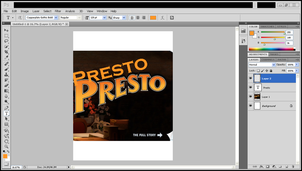
Below are the pictures of the proccess of my work.
photoshop sc5.5
Presto was challenging for me because it
was hard to warp the letters to match the
real presto logo. I used shaddowing at the
top right conrners. I also made sure to add
a black and white line around the text to
match the logo as well as possible.
The real text was difficult to match
but I got as close as i could.
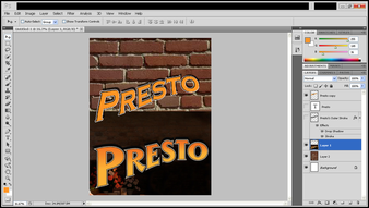
Below are the pictures of the proccess of my work.